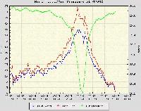
When a few colored lines on a weather chart from a location two thousand miles away freaks you out, it’s a sure bet that something nasty is happening.
 Is this graph off the chart (no pun intended) or what? Notice how the atmospheric pressure drops like a rock as the wind speed picks up. Makes me wonder if Daniel Bernoulli didn’t discover his famous Principle regarding the inverse relationship between fluid velocity and pressure while hunkered down in the middle of a category five maelstrom.
If I ever saw an altimeter setting that low, I’d suspect a) equipment failure, b) it’s April 1st, c) poor eyesight on my part, or d) the end of the world.
Alex, I’ll take earthquakes thank you very much.
