
Since the House of Rapp has been tormenting Netizens since 1995, there’s quite a bit of internet design history here. Let’s take a look back and weep, shall we?
1995: First the Earth Cooled, then the Dinosaurs Came…
The site started on one of the Web’s first open (ie. not AOL, Compuserve, Prodigy, or the like) web hosting providers, a long-since vanquished company called Deltanet. They’d send you a floppy disk via U.S. Mail with the TCP/IP stack software needed to connect via the prototypical dial-up modem. You couldn’t download it because there was no way to get on the internet at that point. A real chicken-and-egg scenario.
I didn’t even have a domain registered. Big mistake! Names like McDonald’s, Walmart, and so on were unclaimed and I could have made millions… or been sued. I suppose you never know which way domain squatting will go when you’re playing with the Big Boys. Anyway, domain name registration was free in 1995, but somehow nobody had the bright idea to begin abusing the system yet.
There are no screenshots from the earliest version of the site, but that’s okay, there wasn’t much to look at beyond text and a few simple images anyway. Here’s what it looked like a year later:
Pretty basic, right? Remember, Internet Explorer hadn’t been invented. Netscape Navigator was the web browser, and they had just released a version where background colors could be specified! Prior to that, backgrounds were grey, period. There was no Javascript, no CSS, not much of anything really. In fact, more than a few people who were on the Web in those days were still using Lynx, a text-only command-line browser.
I registered rapp.org with the InterNIC (remember them?) on July 26, 1996. When it came time to select a Top Level Domain, I selected .org because at the time, I didn’t think an individual could register anything in the .com TLD since individuals were not commercial entities. Now I look back on it and laugh, but at the time it seemed my application might be rejected if I made the wrong choice.
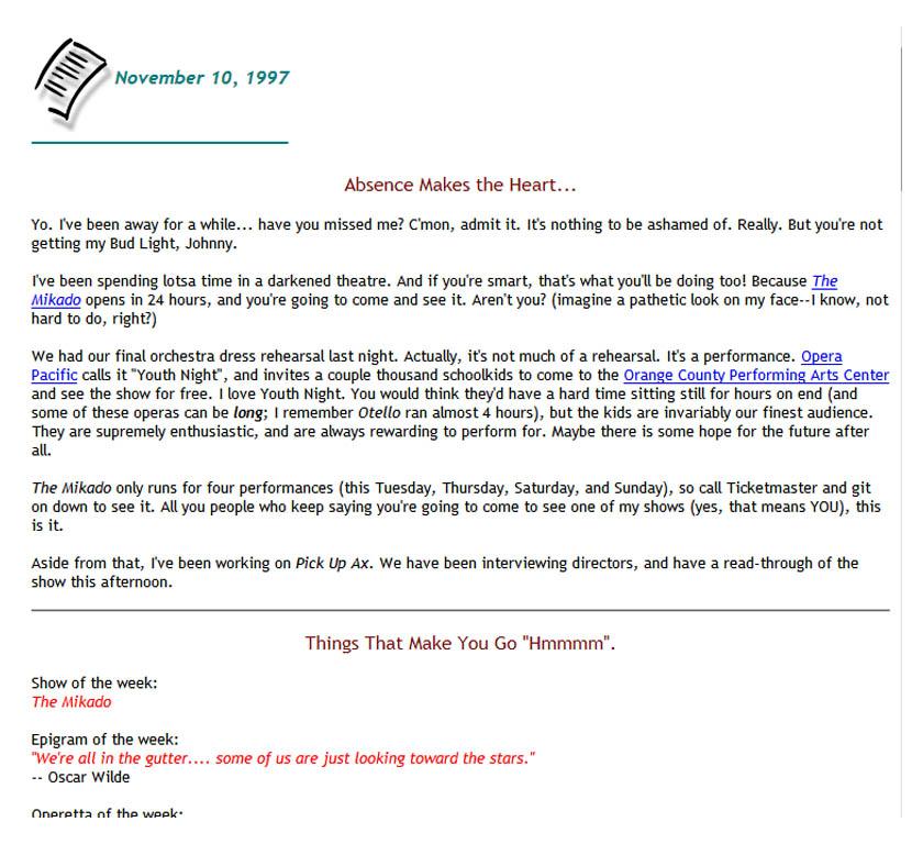
1998: In Living Color!
Netizens were easy to please in the mid-late 90’s. Between colored backgrounds and the infamous “blink” tag, lousy web design was already off and running. I took a slightly more nuanced approach with version 2.0 of the House of Rapp. At the time I was involved in a lot of professional theatre and opera, and this is what the site looked like:
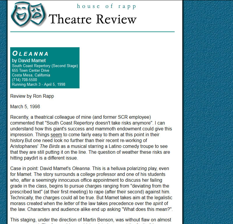
The design was accomplished using table tags. CSS and Flash hadn’t been invented yet, so this was the best we could do.
2002: Frames Suck
Since the statute of limitations on web development crimes against humanity has expired, I’ll admit it: I once used frames. If you’re not familiar with this abomination, consider yourself fortunate.
Much like mutton chops and bell bottoms, we all thought frames were a great idea back in the day, but as the years went by it became obvious that they caused serious problems: the user’s back button often wouldn’t work, the URL in the address bar never changed, pages couldn’t be easily printed, and search engines were unable to link the whole frameset properly.
I was never happy with this iteration of the site, but was too lazy to do anything about it. This was the era when the House of Rapp featured a web cam of my office so people could watch me work. It sounds ridiculous now, but at the time people seemed to love it.
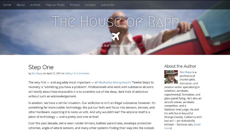
2005: Say Hello to My Little (CMS) Friend
After a decade of hand-coding my HTML with the default Notepad application in Windows, writing on the web was a drag. There were tools out there to make life easier — Blogger, for example, had been around for a few years — but I was never big on trusting my own content to a third-party service. I want control of my ones and zeros, thank you very much.
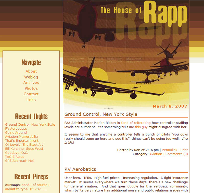
A product called Movable Type had caught my eye the previous year and I began converting the site over to this (at the time) free, open source Perl-based Content Management System. This was shortly after I started flying professionally, so the House of Rapp’s design and content began to reflect that focus.
Spam had long been a serious problem for e-mail, but suddenly advertisers discovered a new victim in the form of bloggers and personal web sites. They began sporting ads on the top and bottom, as well as in the margins and even within the body text. I decided that Rapp.org would remain advertisement-free forever.
2010: The Adult Years
A few years after my conversion to Movable Type, developer Six Apart decided to switch over to a commercial model, so I joined many of their users — and later, about half of the entire Web — in switching to WordPress. As always, the self-hosted version of course.
The ease with which things could be published on the Web meant more sites with less content than ever before, while the variety of themes and designs available had created a beautiful ecosystem wherein one needn’t know a thing about web development in order to have a badly-designed site. Too many columns, plug-ins, widgets, and other detritus left the content swimming in a sea of junk like a survivor clinging desperately to a piece of flotsam after the ship goes down.
I tried to avoid that with version 6.0. How did I do?
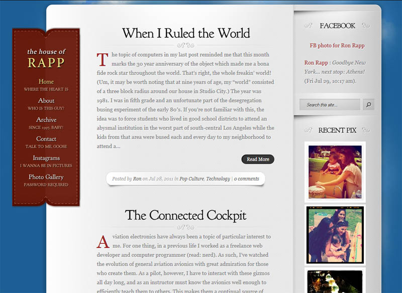
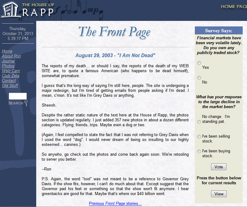
2013: Back to the Beginning
You’ve probably heard the saying, “fashion is cyclical”. Well so is web design, apparently. Eighteen years after starting the site, it didn’t look much different than it did back on Day One. Single column, dark text, and a grey background.
Kind of makes me wonder why I invested all that time and effort in revamping the look of the place so many times. Of course, the answer to that is simple: I like to tinker. For many years, I worked as a professional web developer and even though it’s no longer my primary vocation, I still enjoy the process of design and coding.
As you can see, skeuomorphism was out and the flat design ethos was all the rage. I went with this look because in an era of huge flat screens, tablets, and smartphones, I felt it was important to have a fast-loading, device-agnostic theme to ensure the content (which has been, is, and always will be king) remains as accessible as possible.
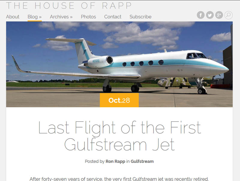
2015: Gonna Wash That Gray Right Outta My Hair
Shortly after repainting our physical house with elephant gray paint (which looks great, by the way), I began to tire of seeing it on the walls of my virtual house. So the old look was replaced with a clean white background accompanied by fonts and imagery designed to cater to the latest generation of high-def monitors and devices. As always, the emphasis is on readability. There’s no point investing time in new content if visitors have an unpleasant experience trying to read your writing.
Feast your eyes on version 8.0:
You’ve probably noticed that the screenshot proportions have changed over the years. The initial designs looked vertical while the latest screen captures are more horizontal. That’s because of the prevalence of wide screen monitors and higher resolutions. It’s just one of the many hallmarks of the passing of time. Speaking of which, hopefully the one constant throughout the years is quality content. If that goal is achieved, the design faux pas don’t hurt quite so much. 🙂